JSXGraph - mobile-friendly examples
By Murray Bourne, formerly of intmath.com.
Update: 2022
This page was originally developed when JSXGraph was decidedly not very mobile-friendly.
In the meantime, version 1.4.1 was released in early 2022, and this improved considerably how JSXGraph can be developed for mobile devices. A lot of the original hacks I needed to use are no longer necessary since it's now possible to style the JSXGraph parent DIV using CSS only - it doesn't require fiddling with setting widths and heights with javascript.
This page now makes use of those improvements, and things are now much simpler.
Overview
This "mockup" page contains several JSXGraph mobile-friendly examples, and explanations of how each is achieved.
Related page: This example page is intended to illustrate the points made in the talk given at the JSXGraph conference in October 2020: Presentation slides. (As mentioned in the "Update" above, many of the things I talk about in the slides are no longer necessary for mobile-friendly JSXGraph pages.)
Page layout
The page itself needs to be responsive. In this case, we're using a flex page layout, with:
- a header (responsive width)
- a fixed-width aside (sidebar, 150 px wide)
- a "main" content area (responsive width), which will contain the JSXGraph graphs
- a footer (responsive width)
When the screen width is less than 600 px, we go into "phone mode" using a media query, where each section occupies the full width of the screen.
@media screen and (max-width:600px) {
  body, aside, main {
    display: block;
  }
}
Summary of the responsive design approach
For the best mobile-friendly JSXGraph pages, we don't set the width and height of the DIV using javascript. Rather, we make use of CSS, which will automatically work OK no matter what size screen we use.
Width
Setting the width of the JSXGraph DIV is straightforward with CSS. We can use either:
- Nothing; and the DIV will be the full width of the available space;
OR - Set the maximum-width to be (e.g.) 500 px if we don't want a huge graph:
  #j2 {
    max-width: 500px
  }
See examples below and in the source code.
Height
To set the height of the DIV, we make use of CSS's "aspect-ratio" (which is the ratio width:height):
.ratio10x1 {
  aspect-ratio:10
}
So in this case, the height of the DIV with class="ratio10x1" would be 1/10 of the width of the DIV.
Here's an (empty) DIV with that class, for illustration. It's width is the available width since I haven't set it to be otherwise, and its height is 1/10 of its width.
Example 1. Full-width graph
To achieve a full-width graph, we only need to set the height of the JSXGraph <DIV> using the aspect-ratio approach (the width of a DIV is by default the full width of the available space).
Let's assume for this example we want the height to be 1/3 of the width. We use the following CSS for the DIV with id="j1":
#j1 {
  aspect-ratio: 3
}
Next, we create the JSXGraph, as usual (within the doGraphs() function):
var brd1 = JXG.JSXGraph.initBoard('j1', {
  boundingbox: [-1, 3, 12, -2],
  axis: true,
  showCopyright: false,
  zoom: {
    pinchHorizontal: false,
    pinchVertical: false,
    pinchSensitivity: 7,
    min: 0.5,
    max: 2,
    wheel: true,
    needShift: true
  },
  pan: {
    needTwoFingers: true,
    needShift: false
  }
});
...
The zoom and pan directives are there to disable the pan and zoom when the user is scrolling. You could always disable it for up to a given screen width.
This is the result. (See the source for the full code.)
NOTE: Fixing resize issues
I've included a circle (blue) and a point (orange) on the graph, which are about the same size when viewing on a desktop. You'll notice that the circle resizes along with the rest of the graph when you change screen size, but the point remains a fixed size, as it should. This may not be desirable (since your point may overlap other content).
To change point size as you resize the screen you can do something like the following in a resizer function:
var j1_gbcr = document.querySelector('#j1').getBoundingClientRect();
var newSize = j1_gbcr.width/100;
pt1.setAttribute({size:newSize});
(This is not a working solution - just a rough indication for how you could start to address the issue.)
Example 2. Rectangular graph; max-width 500 px
In this example, we wish to have the width no greater than 500 px, and the height of the DIV with id="j2" set as 1/2 the available width, using:
#j2 {
  max-width:500px;
  aspect-ratio:2
}
We then proceed to set up the board and add elements as usual:
var brd2 = JXG.JSXGraph.initBoard('j2', {
        boundingbox: [-2.5, 2.5, 4, -1],
        axis: true,
		...
}
In this example, the text moves as the slider value is changed, and it displays that value.
On really small screens, I've set aspect-ratio: 1.65 so things are not so squashy.
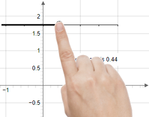
NOTE: Avoid fingers hiding important elements on phone
When you have interactive elements (like sliders) and other important elements (like explanatory text), make sure the slider is near the bottom of the graph, and the text is above it, like I have above. Otherwise, the user's finger or hand will hide the text as they interact with the slider, as we see in the following image:
Example 3. Square graph and max-width 500 px (with max-height: screen height)
So far, our examples have fitted into the screen height successfully. As the graph height increases, we need to be careful not to make our graph taller than the available screen height.
This example shows a square graph, also with maximum width 500 px, but this time we allow for the height when a phone is in landscape orientation. We make use of vmin. The part 100vmin means the "viewport width or height, whichever is smaller". We leave a bit of space around the graph using calc(100vmin - 1em) so the user can see they are looking at the whole graph.
  #j3 {
    max-width: 500px;
    aspect-ratio: 1;
    max-height: calc(100vmin - 1em)
  }
Finally, we create the board and the board elements as usual:
var brd3 = JXG.JSXGraph.initBoard('j3', {
  boundingbox: [-2.5, 6.5, 4, -7.5],
  axis: true,
  ...
Example 4: Use whole screen
This next example gives us the largest graph possible within the constraints of the parent element (in this case, it's the <main> tag) and the screen height.
#j4 {
  height: calc(100vmin - 1em)
}
Example 5: Fullscreen mode
Following on from Example 4, you may wish to use Fullscreen mode, which creates a popup overlay containing the graph only.
We're using the following CSS for this one:
#j5 {
  max-width:400px;
  aspect-ratio:2;
  max-height: calc(100vmin - 1em)
}
Click on the square (⛶) on the left of the navigation buttons near the bottom center of the graph. To escape fullscreen mode, click the square or press "Esc" on your keyboard.
There are some fullscreen mode issues when changing screen orientation on a phone (only part of the graph is shown).
Example 6: Narrow, tall graph
When we want a tall, thin board, we need to limit the height using vh i.e. "view height" (not vmin this time):
 #j6 {
  max-width:200px;
  aspect-ratio:0.4;
  max-height: calc(100vh - 1em)
}
Concluding remarks
Hopefully that all makes sense and works for you!
Feel free to make use of any of the examples on this page as a template for your own mobile-friendly JSXGraph pages.