Ensuring your JSXGraph app is mobile-friendly
Murray Bourne,
(formerly) intmath.com
Update (2022): This talk was originally developed when JSXGraph was not very mobile-friendly but version 1.4.1, released in early 2022, has improved things considerably.
The JSXGraph Examples page makes use of the updates.
Why?
- Developers use large-screen monitors
- Students require laptops to view content
- Phone sales > laptops since 2016 (ref)
- Most JSXGraph pages are not responsive (phone-friendly).
JSXGraph concepts
- The developer creates an empty DIV and gives it an ID.
<div id = "j1"></div>- Then, in javascript, we create the board:
var brd1 = JXG.JSXGraph.initBoard( "j1", {...} );- By default, a DIV takes full available width, but has height 0.
- How to set the height of empty DIV?
- How to maintain width:height ratio?
Example - fixed width and height
<div style='width:600px; height:200px;' id=...
(Not so phone-friendly...)
Example - now mobile friendly
(Try it on a phone.)
Need to allow for...
- Phone height
- Portrait orientation

- Horizontal orientation
- Change of orientation; resize
- Scrolling (which can trigger resize)
- Space around the JSXGraph <div> for scroll (by finger)
Procedure for mobile-friendly JSXGraph
- Develop for mobile first!
- Best not to set the width and height of the JSXGraph <div> using javascript...
- We use CSS instead.
Procedure: Width
- The width of a <div> is 100% of available width by default.
- If we want to set a maximum width, we simply wrap our JSXGraph DIV like this:
-
<div class="wrap500"> <div id="j2"></div> </div> - We set the style of the wrapper as (e.g.):
  .wrap500 {
    max-width: 500px;
    margin: 0 auto
  }
Procedure: Height
- We set the height of the empty <div> using the "Intrinsic Ratios" approach:
.div10x1 { height: 0; padding-bottom: 10% }- That will give us a DIV with height of 1/10 the width. Example:
Procedure: On resize
- We use
resizeContaineras follows: -
// Need to unset these so containing DIV can change size j1.style.width = ""; j1.style.height = ""; var theWidth = j1.getBoundingClientRect().width; var theHeight = j1.getBoundingClientRect().height; j1.resizeContainer(theWidth, theHeight); - Unset the current width and height
- Get DIV width and height (set by CSS)
- Change board dimensions
- We run this on each resize.
Example: Square case
Handling resize
When the user resizes the screen:
window.addEventListener( "resize", resizeThrottler, false);- We use a resize throttler to save CPU load.
- In
resize throttlerfunction, callboard.resizeContainersnippet
Example pages
- 1. "Real" examples:
- Polar → Rectangular calculator
- Game of Life (presentation)
- Game of Life (friendly)
- 2. Here's a mockup page showing 3 examples with explanations:
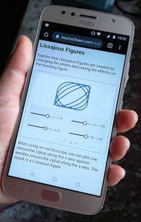
- JSXGraph Examples

The end!
Thank you!
 @bourne_2_learn